


Minimalist poetics

It is evidently difficult for our critical friends to talk about abstract art in 2021.
Beaux-Arts takes a chance on the reunion of recent works by Michel Verjux and Nicolas Chardon in the same exhibition space. The former, who sculpts light by projecting it onto the walls of an enclosed space, honours the promise of roundness in the title of the exhibition "Squares and Circles...". The second is a distant heir of Malevich. He takes charge of the angular part of the event with his paintings dominated by equilateral quadrilaterals.

And here we are again in the mythical 1920s. The so-called Roaring Twenties. Let's not forget that a century has passed since the legendary White Square on a White Background. So it took 100 years to go from the founding squares of abstract art to the perfectly twin squares presented here as its official continuation. And between the two is supposed to have passed a century of art history. Are we being taken for idiots?
In any other area of human life, such a microscopic shift would be called a guilty stagnation because it is pitiful in terms of profitability. It is difficult to cry genius here without thinking that we could just as easily admire the rectangles of protected crossings painted on the asphalt by road workers. Technically, in both cases, we are light years away from the pictorial mastery that a Rembrandt or a Dali felt obliged to acquire. As if in honour of the potential of the brush.
To speak well of the thing is therefore an exercise that is anything but obvious. Beaux-Arts takes a chance. Who would do it if art magazines refrained from doing so? So we are entitled to formulas such as "theophany" to legitimise the depth of the "immaterial plastic spaces" created by Verjux's luminous visual games. And we are ecstatic about Chardon's use of printed fabrics as canvases, to which he imposes a "deformation" presented as a major trademark.
A century to go from canvas to textile stretched as a support for squares is a bit long, isn't it? But we don't mind talking about these works in terms of narrative. What is the point of pointing out that the white frames of Nicolas Chardin's squares are a laudable nod to comic book panels? The evocation of Roy Lichtenstein, to which this connection inevitably invites us, also sends us back more than 50 years. A fine innovation.
How can one consider that staying at the same point constitutes a form of progress? It is very simple. If artists like Chardon and Verjux appear futuristic, it is because the rest of our world has regressed in terms of artistic culture and awareness. We are going backwards! And abstract art is not moving. So we have the feeling that it is moving forward.
In the end, it all comes down to the loyalty that some of today's artists show to a minimalist mode of self-expression, representation of the world or pure production of meaning. We are talking here about "restriction of the colour palette", "stripping away the motifs" and "economy of means". The avowed aim of this aesthetic is at least to be seen as a medium to gain in "poetic charge".
In this case, it is difficult to disqualify the "poetic minimalism" of Jeff Koons' Balloon Dogs. Are they too big? Too fluorescent? Too evocative of the commercial society of which they evoke one of the most futile aspects? Not spiritual enough?
The problem is not necessarily so much with the works themselves as with the way they are viewed or 'consumed'. Banksy's fans may call his little girl with a balloon poetry. But by poetry they will mean the touching side of childhood or the sadness of the toy's flight. In short, the work will be sold to you for the poetry of the situation and not for its own poetry, which adds nothing to the matter.
Touching little girls painted or drawn with the same naivety populate pages and pages of comics. Fans of Banksy's street art do not sublimate their boxes for all that. Lack of street credibility! Blinkers that sectarianism gives. The difference is that Verlux and Chardin, for example, impose such a sublimation on their works. That is why these resistors to the general backsliding want them to be minimalist.
Remove their "poetic charge" inherent in their very form, and nothing remains. Which means that anything else that sticks out is just a spectacle.
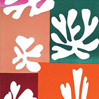
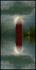
Illustration:
- Nicolas Chardon - Damier rouge - 2012
- Michel-Verjux-Staccato stabile - 2016